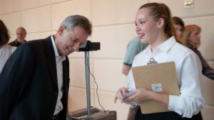
On September 7, 2019 an extended family of PIRL collaborated with Maestro Clay C to produce Celestial Celebration: Music, Art, and Technology, a multimedia performance and installation inspired by the 50-year anniversary of the Apollo 11 Moon Landing. PIRL designed and built six interactive exhibits and collaborated with Dr. Christine Veras (ATEC/UT Dallas) and Dr. Donna Cox (AVL/NSCA/UIUC).
Touching Histories
UTD Celebrates 50 Years
 Project Leads: Heidi Rae Cooley and Dale MacDonald
Design / Production Team:
Alex Remington
Danai Bavishi
Anthony Inga
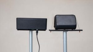
Materials:
Ideum Presenter display
UT Dallas official 50th anniversary web-based timeline available at: utdallas.edu/50
Archival materials provided by UT Dallas University Archives, Treasures @ UT Dallas, SMU Libraries, Internet Archive, The City of Dallas Vault
Project Description:
 The 50-year history of the University of Texas at Dallas is deeply intertwined with Texas Instruments, the City of Richardson, and the technology-rich region of North Texas.
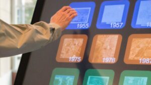
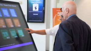
This large format touchscreen displays the official University timeline, produced by the UT Dallas Office of Communications, that describes the most important milestones in the 50-year growth of the University. The chronology references the contributions of noteworthy people, significant events, the expansion of the campus, and the launch of innovative educational and research programs.
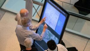
This installation presents four additional interactive historical episodes. Guests are encouraged to explore the content to read how UTD campus traditions, institutional aspirations, and regional influence evolved over five decades.
Interactive History Episodes:
Campus Traditions
UT Dallas Connected
Views from Above
The Calculator: An evocative object for STEM education
Listening to Apollo 11, 2019
Project Leads: Dale MacDonald and Heidi Rae Cooley
Design / Production Team:
David Wilson
Caroline Trotter
Eva Jacobus
Special thanks:
John Hansen, Center for Robust Speech Systems, UTD
Materials:
3 channel interactive audio installation
Archival audio material from analog Apollo 11 mission audio, digitized by the Center for Robust Speech Systems at UT Dallas
Raspberry Pi, speakers, RFID cards, RFID reader
Project Description:
 Neil Armstrong’s proclamation, “One small step for [a] man, one giant leap for mankind,” is the most famous testimony of the historical significance of the first moon landing on July 20, 1969.
Over the course of eight days, many other voices, statements, and conversations marked other significant moments of the mission. For example, during the descent of the lunar module on that same day, a tense and extensive conversation ensued among people at distributed stations of Mission Control about an alarm emanating from the flight control computer. The public never heard this conversation, but for the engineers and astronauts it was extremely significant given the riskiness of the mission. In this interactive, you can listen to the multi-channel conversation about the “1202 alarm,” which is one of twelve short multi-channel conversations from that historic mission.
 Ground-breaking research by the Center for Robust Speech Systems (CRSS) at the University of Texas at Dallas allows us to hear the conversations as only a few people in Mission Control would have heard. CRSS successfully digitized 1000s of hours of recorded communications between astronauts, mission control and back-room staff.
Listening to Apollo 11, a public listening experience, draws on this vast audio archive. Visitors can listen to mission conversations never before heard by the public. The installation highlights the importance of research into speech processing technologies, as well as the role that audio research plays in understanding complex historic systems of communication.
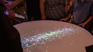
Astrotables, 2019
Celestial Powers of 10
Touring Holst’s Planets
Following Apollo 11

Project Lead: Dale MacDonald
Design / Production Team:
Danai Bavishi
Eva Jacobus
Caroline Trotter
Solvay Linde
Materials:
Astrotables by Onomy Labs
SpaceEngine (Universe Simulator)
Project Description:
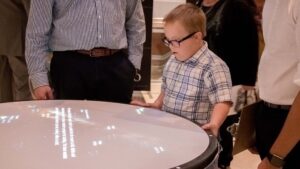 The Astrotables display custom-designed interactive visualizations using the Space Engine Universe Simulator. Originally produced by Onomy Labs, an Astrotable enables body-scale explorations of the Universe. The table becomes a computer interface device. Animated visualizations of space data are projected on the tabletop. Spinning the tabletop controls the magnification of the visualization; tilting the tabletop slides the image to change the view.
Celestial Powers of 10: Drawing inspiration from Charles and Ray Eames’ 1968 film Powers of Ten, this story enables the visitor to travel exponentially through a simulated universe. Starting at the Eisemann Center, 10,000 meters above, the visitor can leap by powers of 10 from the Earth to the “edge of the known universe.”
Touring Holst’s Planets: Gustav Holst’s orchestral suite, The Planets, composed from 1914-1916, presents a tour of the planets that could be seen from Earth in the early 20th century. Holst focused his interpretation on the astrological character of the gods for which each planet was named. This interactive experience enables a visitor to travel among planets to uncover astrological and astronomical stories.
Following Apollo 11: Visitors can follow the flightpath of Apollo 11, stopping at significant waypoints to read information about the mission and the views witnessed by the Apollo 11 crew.
Through the Roof, 2019
Ambient Celestial Projections
 Project Lead: Dale MacDonald
Design / Production Team:
Anthony Inga
Eva Jacobus
Materials:
Rosco Gobo “Celestial 1618”
HighEnd Systems Solaspot Pro 2000 robotic light fixture
Laser projector
Gpredict (real-time satellite tracking and orbit prediction application)
Project Description:
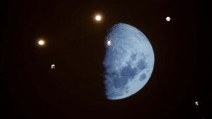
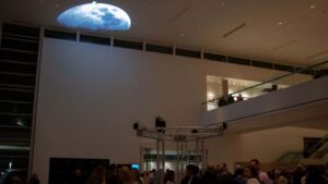 The U.S. Space Surveillance Network uses radar to track more than 13,000 human-made objects larger than four inches (ten centimeters). This celestial detritus includes everything from the International Space Station (ISS) and the Hubble Space Telescope, to defunct satellites, rocket stages, or nuts and bolts left behind by astronauts. There are millions of other smaller bits of space junk such as flecks of paint and bits of plastic. In 1969, the space around our planet was much less cluttered than it is now. Through the Roof uses lasers and lighting instruments to present a visualization of the moon and hundreds of other objects as they passed over the Eisemann Center on September 7th, 2019.
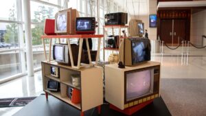
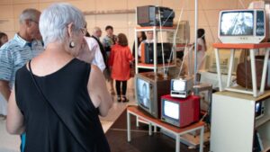
Far Seeing Apollo, 2019
Project Leads: Sean Landers and Anne Balsamo
Design / Production Team:
Grace Brady
Elise Cobb
Abby Mancini
Ira Murchison
Caroline Trotter
Khadeeja Zulqarnain
Special thanks:
Ron Jennings, vintage television engineering
Materials:
Five-channel television broadcast installation
Archival footage: NASA, Johnson Space Center, Archive.Org
Vintage televisions (1968-1979)
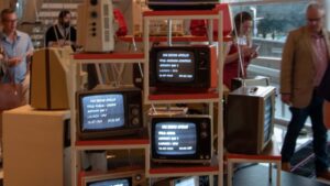
 Project Description:
This installation recalls the domestic spaces where millions of people gathered to watch the first lunar landing. In July 1969, people watched on color televisions bought specifically for viewing the historic spectacle. Many others clustered in front of shop windows and around portable televisions set up in offices to experience the first truly global broadcast of a real-time event.
Media coverage, from every nation, focused on the unprecedented technical and scientific advancements that enabled the mission. Television crews recorded spectator reactions of awe, not only of the landing but also of the national display of the technological prowess of the United States. Verbal remarks from engineers at Mission Control and from the astronauts themselves instantly became iconic statements announcing the arrival of the space age.
 When the Saturn rocket launched on July 16th, we entered our mid-20th century living rooms to watch history in the making, eight days later we emerged into the future.
We All Look at the Same Moon, 2019
Despite our differences
Project Leads: Anne Balsamo and Sean Landers


 We were able to use the various features of the Google Maps app with ease…


